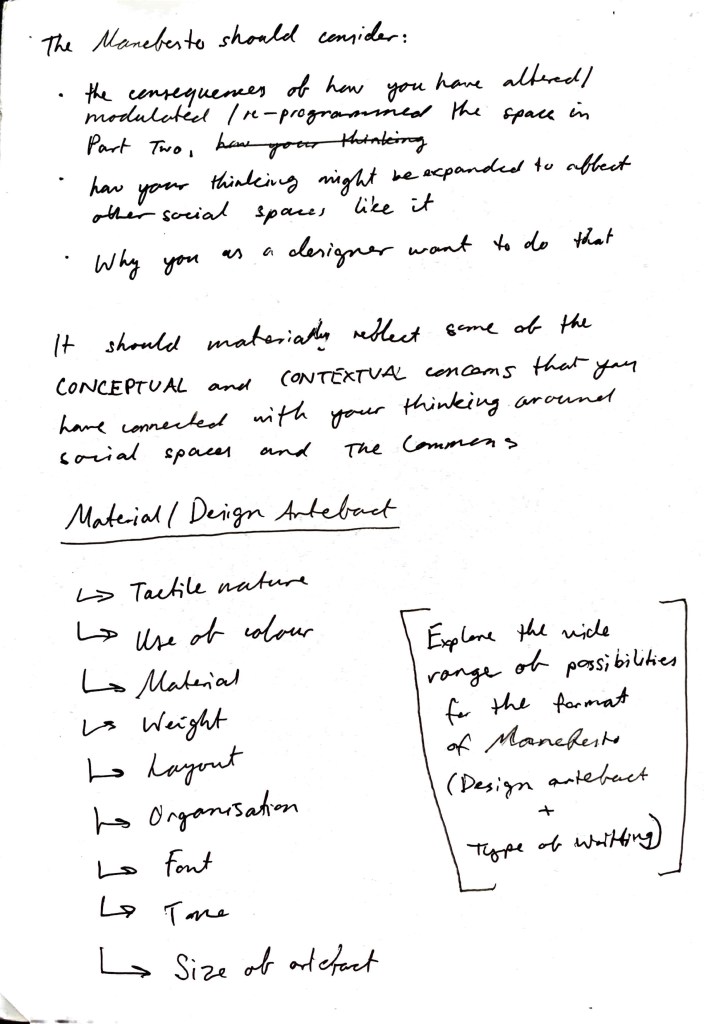
Staking your ground in relation to “The Commons”
(Manifesto, users guide, call-to-arms)

Styles of Manifestos
- Narrative style- telling a story of a character
- Humorous and simple- witty,
- Poetic and imaginative- onomatopoeia
- List style
- Letter style
- Recipe style
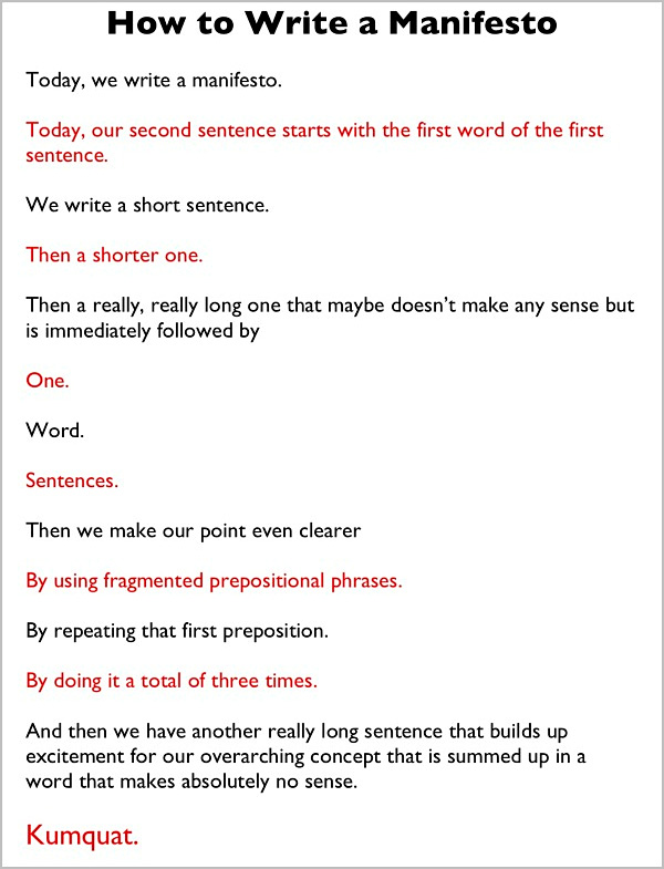
- Variation of short and long/complex sentences
- Repetition for impact
Styles of Layout/Design
- Majority of images (image/s as main focus
- Title as main focus
- Overlap of words and images
- Separated, clean, minimalistic, negative space
- Cluttered, clumsy, overwhelming
- Bold and impactful
- Variation in fonts and word sizes, italics, bold etc.
- Words can cover the page or cluster together closely on a portion of the page
This is one way to lay out a written manifesto:
Analysing Manifestos
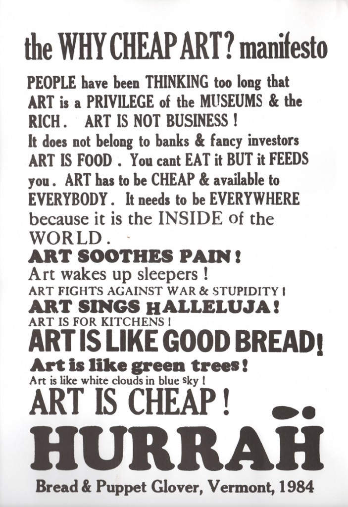
1. Art is Cheap
Tone
- Loud and bold- exclamation marks
- Making a statement
- Mixture of capitalized letters to emphasize certain words
- Preachy e.g. “Halleluiah”
- Expressive, instructional, direct
- Short, simple sentences- impact
Layout
- Mix of straight, thin fonts with bold bubble fonts (creating bold tone)
- Mixture of capital letters and short sentences make it visually stricking and easy to read- eye catching

2. What is to be done?
Tone
- Political statements
- Talking about philosophies
- Ideologies about change in how we perceive society, politics, classes
Layout
- Listing
- Big title heading in the form of a question targeted directly at viewers
- Switches between points 1 and 2 to elaborate, compare, contrast and expand
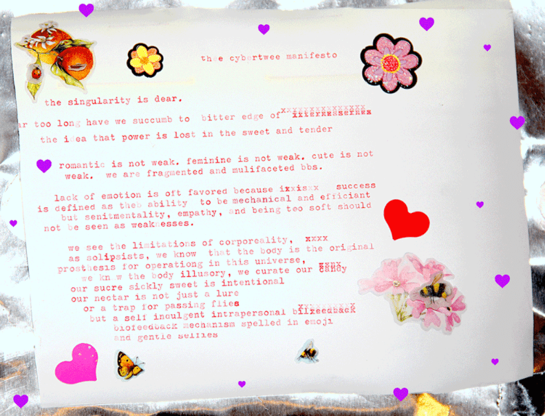
3. The Cybertwee Manifesto
Tone
- Formatted in a personal letter
- Tone is being overly cute, shy, timid, anxious as they talk about this being the thing that isn’t weak
- Using language like “bbs” for effect of being really cue and girly- its dramatic for effect
- Using xxxxx (kisses) in the letter randomly, covering up some words to dramatize being timid and shy, fading out other words to hold back from being loud and bold in their statement
Layout
- Cute, sweet, pretty as the manifesto speaks that femininity and cuteness is not weak- it is beautiful and empowering
- Font is in a typewriter styles, aesthetic and cute. Colours are varying shades of pink
- Decorated in cute stickers and pretty images, remembrance of girls and being young- overly girly and cute, drives the idea of shyness and cuteness further
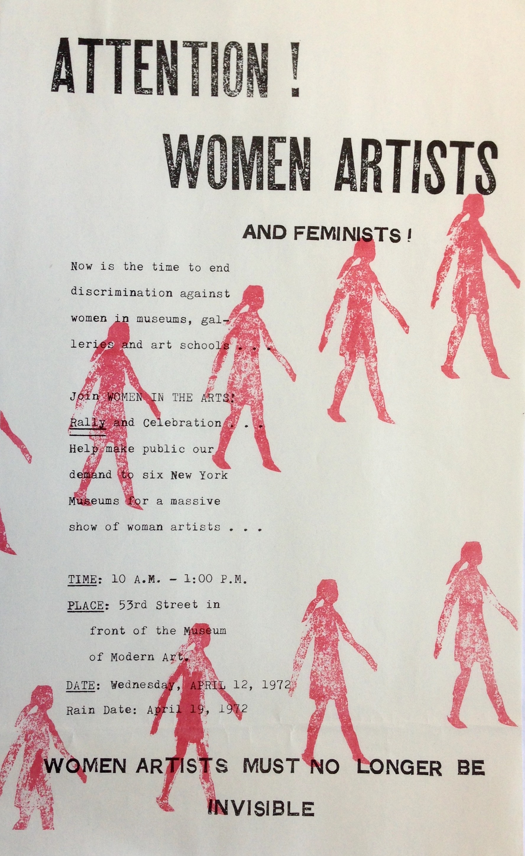
4. Attention! Woman Artists!
Tone
- Protest and statement
- Invitation to join a movement of women artists empowering one another
- Date/time invites
- Final statement is bold and leaves a lasting impression
Layout
- Typewriter font
- Repetition of striking red girl in stamp style arranged in a diagonal array
- Writing arranged to the left of the page in a ‘block’ shape
- Title bold and grabs attention. Use of exclamation marks

5. New Fluxus
Tone
- Dictionary definition style in form of lists
- Tone is factual and informative in nature
Layout
- Busy and bold
- Mixture of illustration styles from modern to old day English/Shakespearean era (which visually shows the theme of old vs new)
- Mix of font-technological, digital prints,
- Hand drawings/sketches
- Three black boxes containing the main content of manefesto floating on the space of the page amounts stand alone words and illustrations
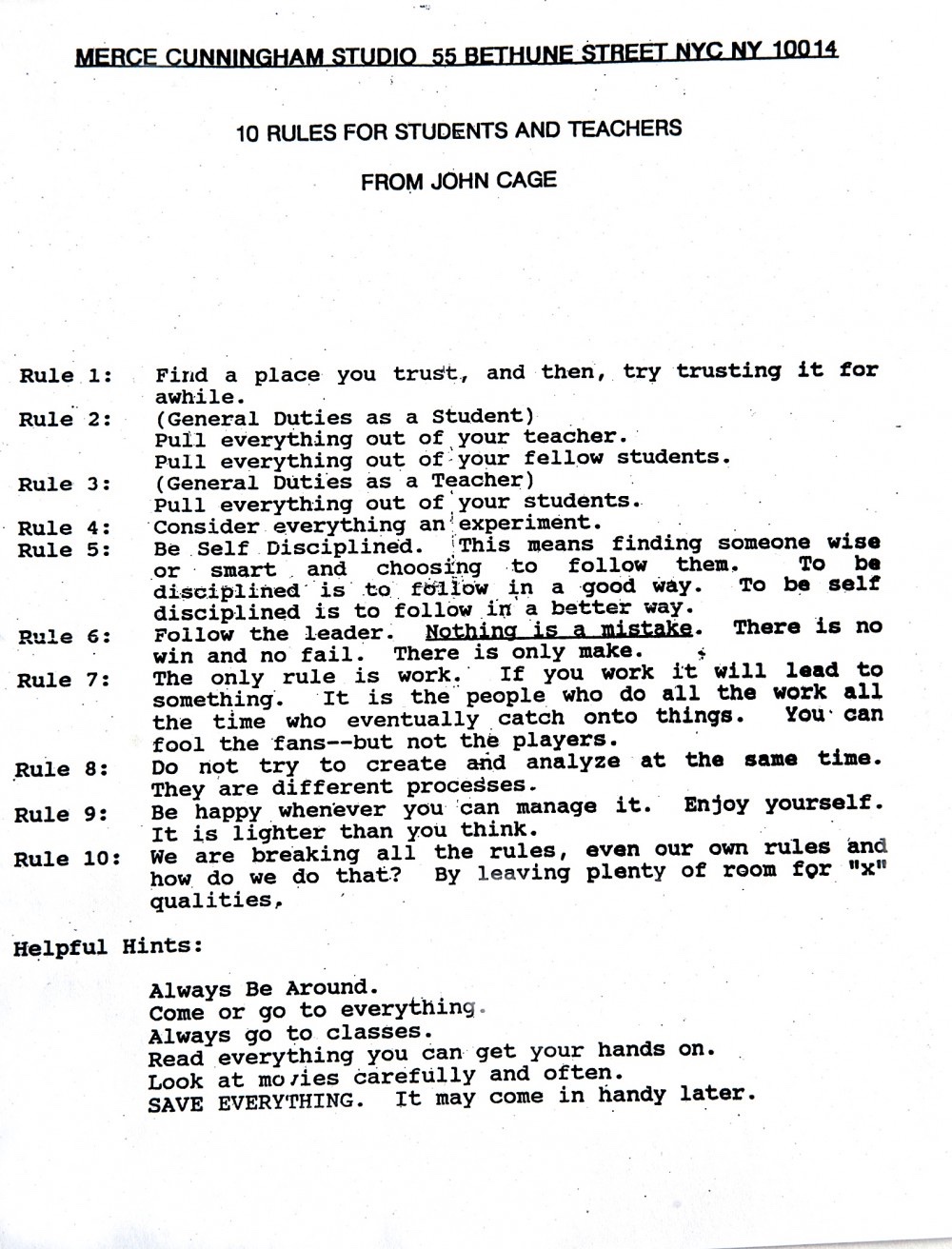
6. 10 Rules for students and teachers
Tone
- Tone is humour is and light hearted while the subject (set of rules) should be seen as more strict and serious
- Playful
- Informative and useful to both teachers and students. Could be a way of life to live in an education system for creativity, collaboration and good work ethic
Layout
- Layout is clean- words dominate the majority of page
- Simplicity and coldness of page layout juxtaposes the humorous content
- Listing- numbered
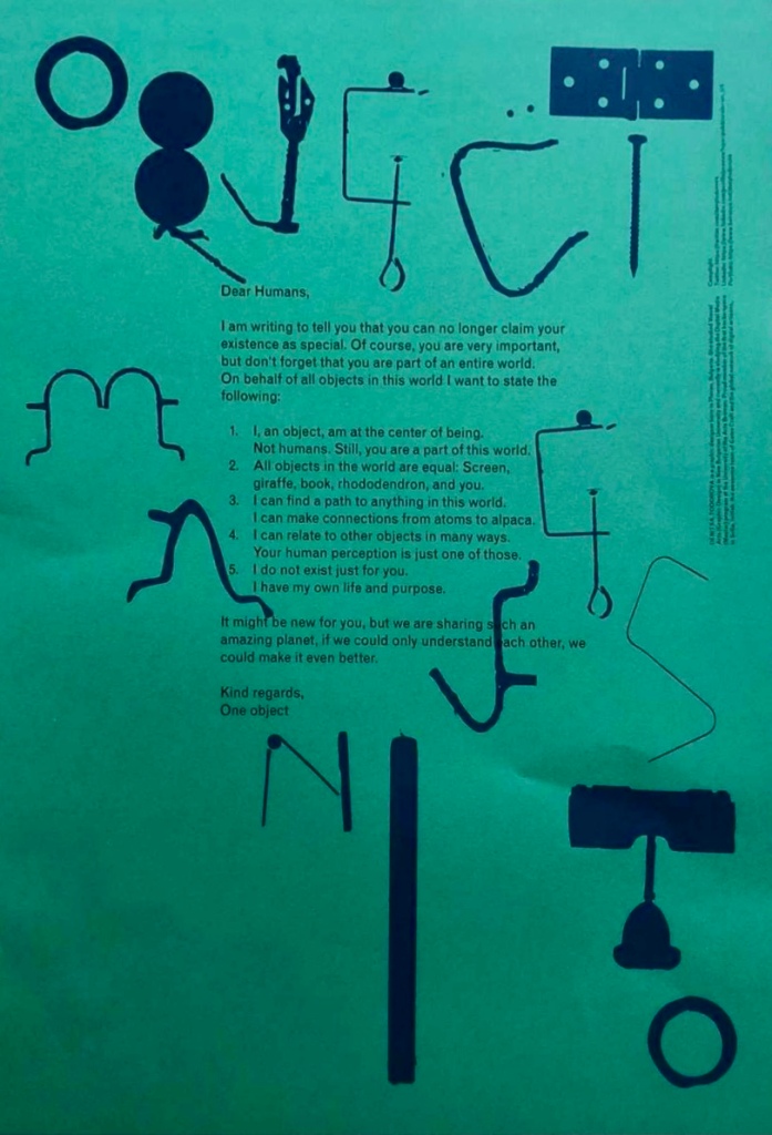
7. Dear Human,
Tone
- Written from the perspective of an ominous object
- Letter written style
- Directed to the entire human race (direct)
Layout
- Font is small and words cover small percentage (centre of page) like a formal letter
- Illustrations of objects frame the letter, bordering the page
- Illustrations are bold and scattered randomly
- Uniformity of letter juxtaposes the spontaneity of image layout
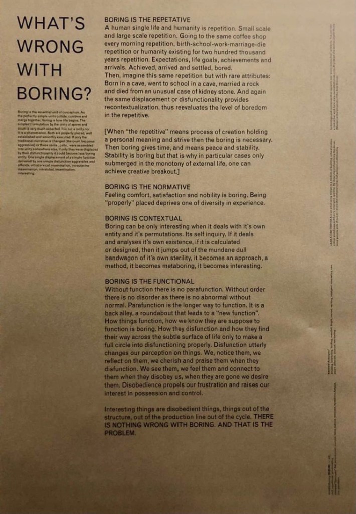
8. What’s wrong with boring?
Tone
- Boring and repetitive which is accurate to topic
- Repetitive in structure
- Bold titles which speak to readers- direct
- Long winded
Layout
- Boxed paragraphs
- Repetitive structure
- Fills centre of page

9. Riot Grrrl
Tone
- Outrageous and over exaggerated
- Rally speech style
- Very direct and bold
- Graphic
- repetitiveness of “because” is quite effective in explaining points for impact
Layout
- Type writer font
- Titles are eye catching and frame the text
- paragraphs are scattered to make each point effective
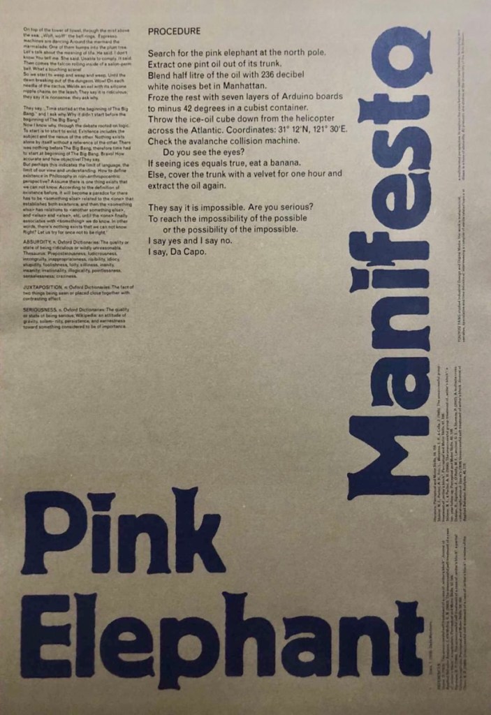
10. Pink Elephant
Tone
- Confusing and miss direction
- Abstract
- Absurd
- Mixture of reality and fiction
- Poetic Brief
- Instructional guide
Layout
- Titles are bold and frame the bottom left comer of the page for strong identity of manifesto
- Small text compared with large layout
- Negative space
- Text cut in half

11. The Cyberfeminist Manifest
Tone
- Written like a “Anonymous” cyber hack message whilst being uplifting and true
- Explicit and provocative language
- Women empowerment- up rise, uplift, give females power
- Give fear to men for the power we have
Layout
- Visually interesting and impactful as it looks like a hacked screen, a declaration, a movement, hope for the future, a new era
- Words take the form of a magnified globe as if we should focus in on this declaration
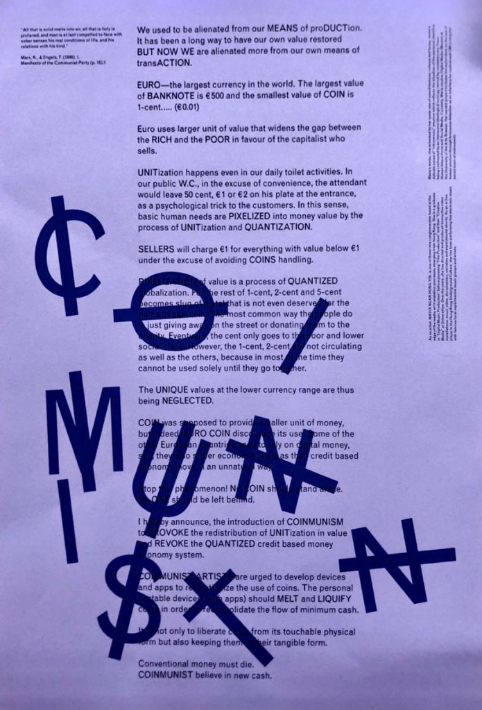
12. COINMUNIST
Tone
- Pessimistic
- Critical of capitalism
- Provocative
- Big statements which are impactful
Layout
- Uses capital letters to highlight intentional and strategic words
- Title is very bold and striking in how its randomly overlaid over text for attention
- Title of manifesto is a play on word playing with the capitalist’s regime of money
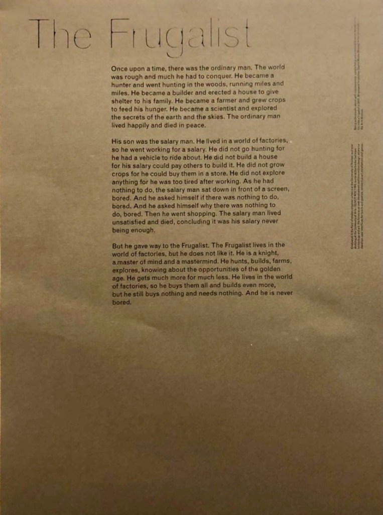
13. The Frugalist
Tone
- Third person narrative style
- Explains the underlining issue of mental illness and the wisdom when people say that the devil finds work for idle hands, they mean that if people don’t have anything to do with their time
- Structure is impactful as the story speaks for itself
- Shows how lifestyle should be about wander and adventure to get fulfillment and happiness in life over work, money, fancy house etc.
Layout
- Layout is minimalistic
- Plenty of negative space
- Words are centered
- The frugalist font is thin and humble- not in the face
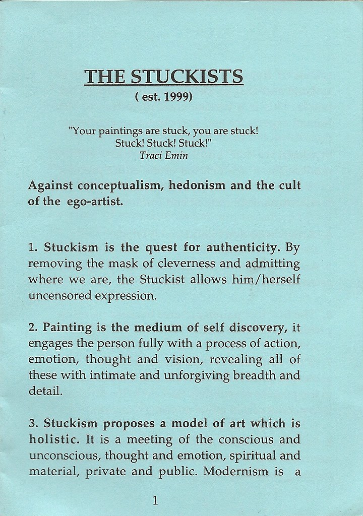
14. The Stuckists
Tone
- expresses thoughts on how being a “stuckist” is beneficial as an artist to grow and create uncensored art- it creates authenticity
- It allows freedom of self expression. Layout of listing makes tone structured and factual- persuasive
Layout
- Lists in a manner of subheadings for clear topics
- Page colour is pleasing to the eye
- Layout looks formal, professional and stablished- trustworthy
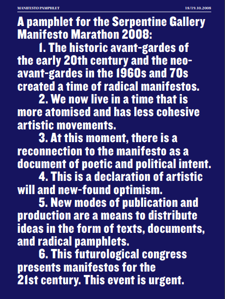
15. Manifesto Pamphlet
Tone
- Formal and structured in a juxtaposition to the content, artistic expression and not following social norms.
- Call to action “This event is urgent”
- Reads like a formal business letter
Layout
- white text on navy background is aesthetic and eye-catching
- Text is thick and bold, less words on the page and bold text make manifesto easy to read
- Listing style presents statements which intrigue and make interesting points
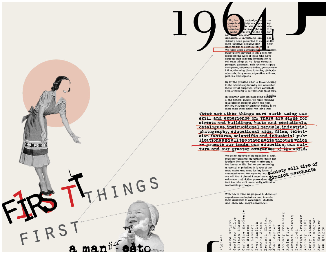
Design | Layout: First Things First Manifesto; 1964
“As a study in postmodern graphic design, I created this Emigre inspired spread as a reinterpretation of the First Things First manifesto which was originally written by a collection of designers and creatives in 1964.”- Barbara Kaplowitz Newburgh, NY, USA
I love the layout of this manifesto. I especially like the collage style, and the addition of older era style of images and the typewriter font which seems to be popular in manifestos as it potentially brings us back to older times where we had different problems in society and less technology. I would like to bring the collage style into my final presentation.
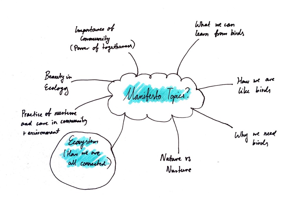
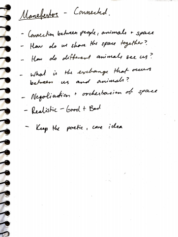
Possible Manifesto Topics:
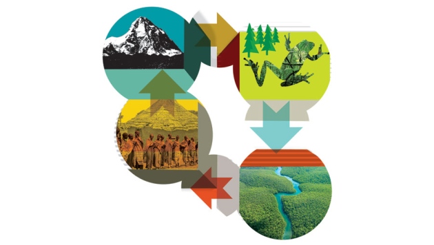
Following my part 1 and 2 topics I wanted my manifesto to be broader to incorporate themes from my observations swimming from the Botany Night Market and Barry Curtis park which are in the same community of people. We are all connected as a community through our ecosystem. We all stem from the same root. I thought this would be an interesting topic to draw on.
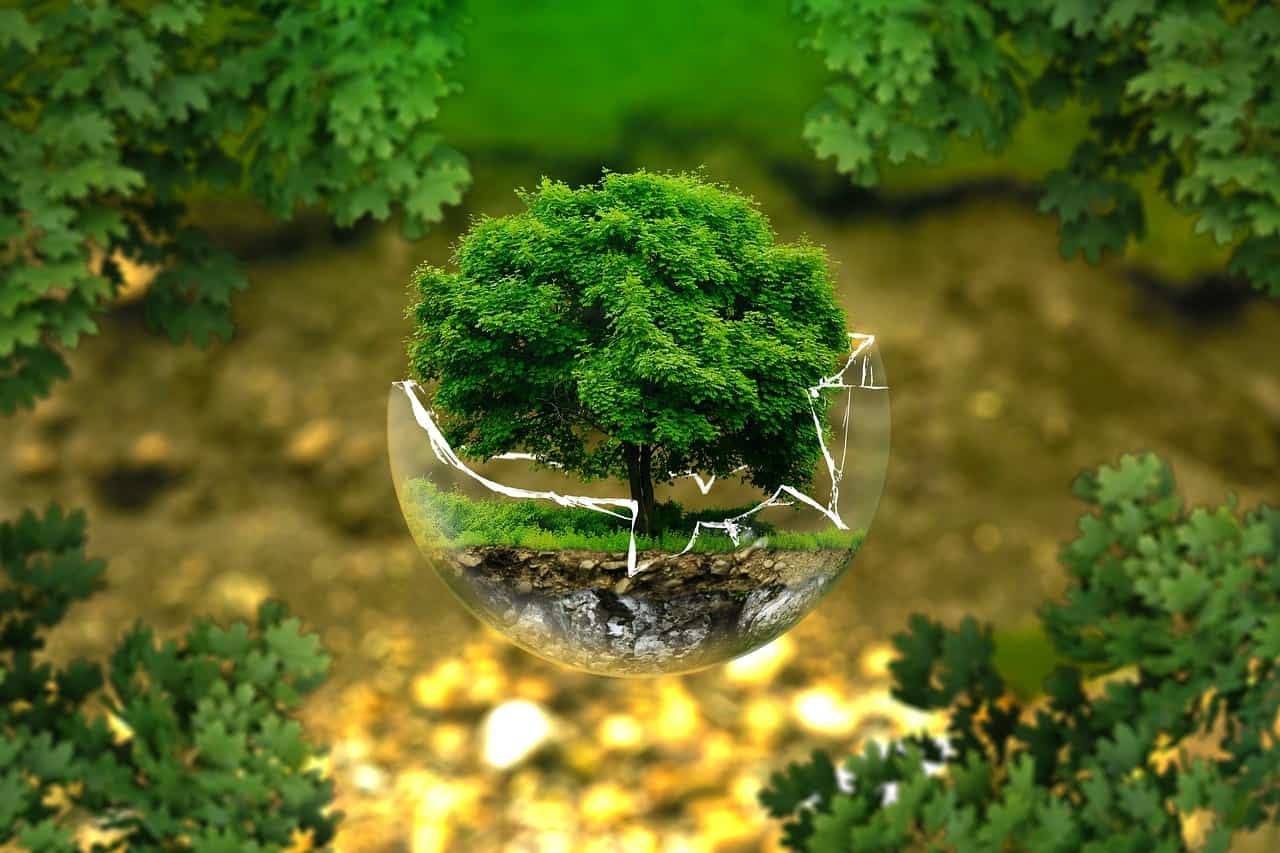
Ecology
For my topic I wanted to do some research on ecology and ecosystem so I could better understand its relevance and importance.
Research
Ecology is defined as the study of interrelationships of different organisms with each other and their environment. It is concerned with the general principles that apply to both plants and animals. The word ‘ecology’ is derived from the Greek words ‘Oikos’ meaning house, habitat or place of living, and ‘logos’ which means to study.
I found this interesting as the term directly refers to space and place- and how we may inhabit it. A point of interest is arising in how we share this space (ecology).
All ecosystems, whether they are marine, freshwater or located in native bush, involve the transfer of energy. Energy flows into an ecosystem usually via sunlight. This light energy is used in a process called photosynthesis, allowing plant matter (flora) to grow. Flora then becomes a food source for birds, animals and insects. This transfer of energy continues as feeding relationships occur between plants and animals.
From this I get a better understanding of the relationship we have to one another and how we are connected. This is quite a beautiful concept to explore. Can we feel this energy? Is there a way to grasp onto it or draw peoples attention to focus on this relationship to grow stronger communities?
A LANDSCAPE MANIFESTO
By Diana Balmori
“This book presents Balmori’s most complete vision yet of the theory and practice of urban landscape design as a discipline that combines the science of ecology with the formal aspects of aesthetics. Here, Balmori advocates a new formal language that reflects a philosophical shift in our traditional understanding of nature, along with “realignments” in how humans relate to nature and live in our world today, changes that will shape the livable city of the future.”
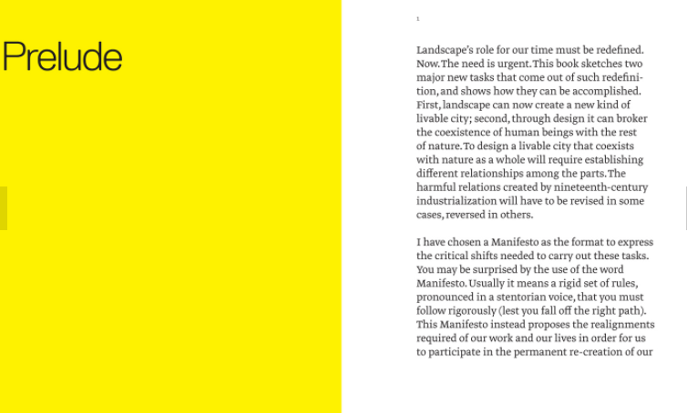
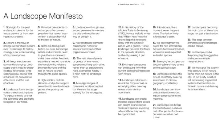
I like the way Balmori reflects on ecology and how humans can relate to it. She makes some insightful points which has opened my eyes to new concepts in relation to issues around ecology and how we tend to ignore its importance and presence in our lives.
More manifestos I browsed over about ecology and nature

Global Change: Ecology must evolve
Excerpt from an article written by Georgina Mace (13 November 2013). Tackling global problems requires a fresh approach, argues Georgina Mace, as the British Ecological Society celebrates its centenary.
“Climate change, the threat of pandemics, population growth, food security and the loss of biodiversity and ecosystem services demand a new kind of ecology — one that focuses on how whole communities of organisms, at the scale of landscapes or catchments, interact with people and the physical environment. The advances in ecology in the past century have hugely improved our understanding of species interactions, such as those between hosts and parasites or between predators and prey, as well as population dynamics, food-web dynamics and how organisms adapt to their local environments.”
First Draft Manifestos


Notes For A Manifesto and Hand In
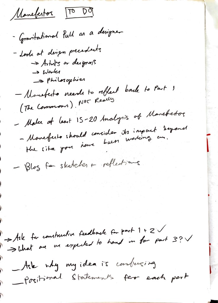
Teacher Feedback
Teacher Feedback (discussion) from parts 1 and 2
Final Manifesto Layout Iterations


Topics explored and to explore in manifesto (notes written after discussion with teachers)
Considering Presentation Layout for Parts 1 and 2

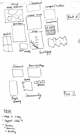
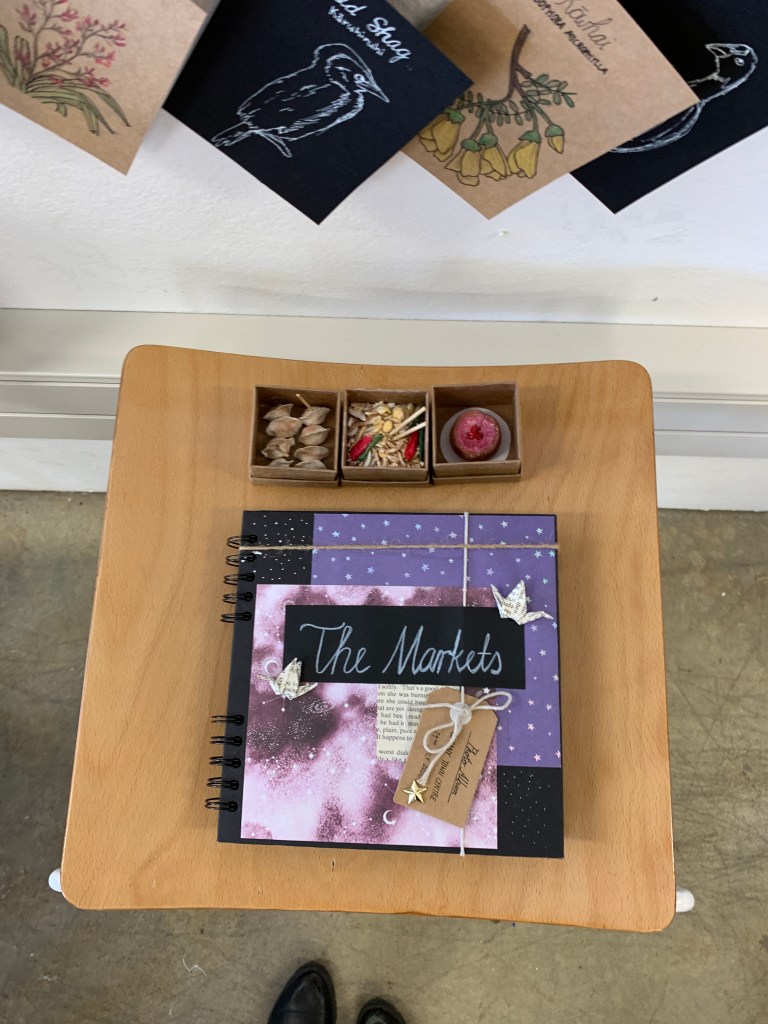
Final Presentation
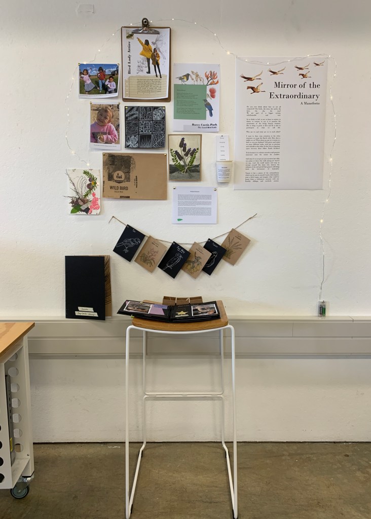

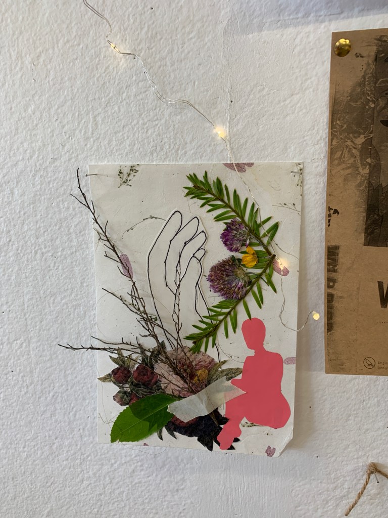
Inspiration (Design Precedent): The following was inspired by French graphic designer Marion Dufour who used an eclectic blend of photos and botanical illustrations to create a collage effect for Le Jardin Naturel (Natural Garden Paris)’s brand identity. I love hoe the clean white page contrasts her vibrant images, textures and elements of nature to create organic, visually aesthetic documents, posters and pamphlets for Paris’ gardens.
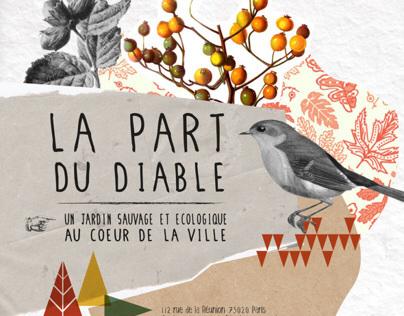


I love the collage style and wanted to bring that in to my own collage as I display my documents on the wall, including making some collages in a few documents both by hand and digitally for aesthetic and to create atmospheric qualities of Barry Curtis park and of nature and ecology.
Close Ups

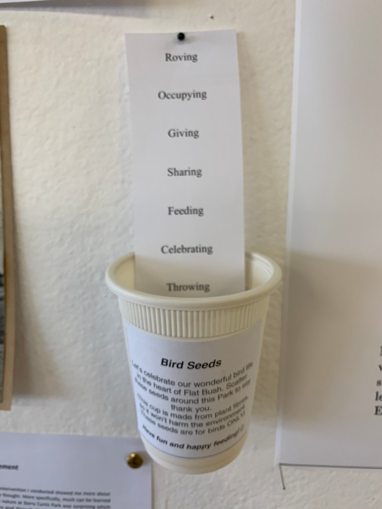
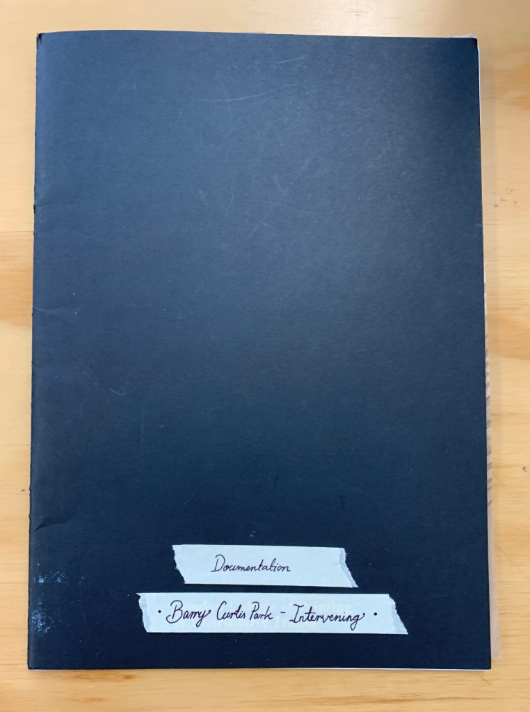
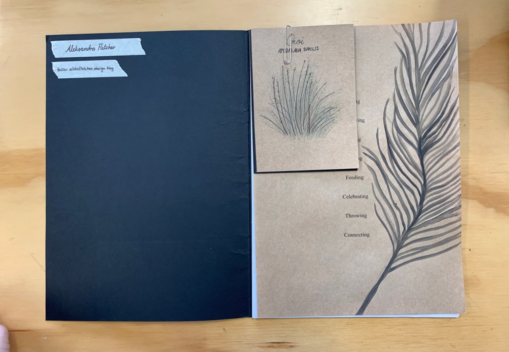
Documentation Folder
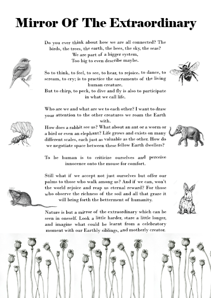
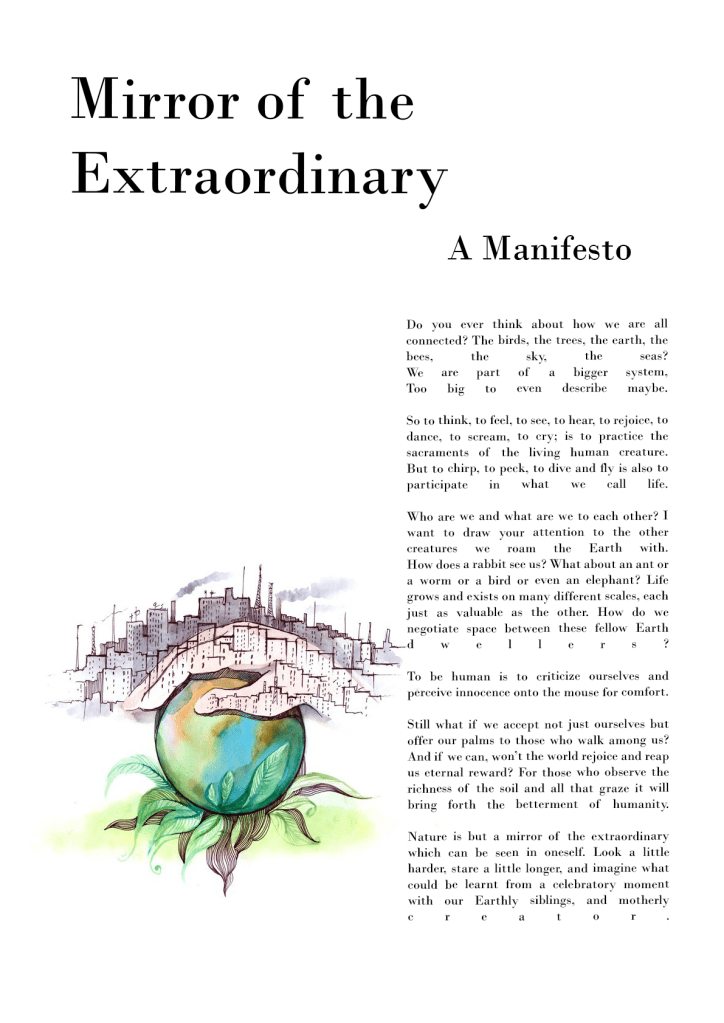
Final Manifesto
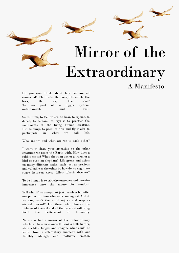
Manifesto Tone and Style
My final manifesto takes on an extrospective tone, challenging how we as a society view ourselves and others, how we share and compromise space, and consider how we are all connected with the earth. I examine the relationship between the internal world of the self and the external world of nature (symbiotic relationships).
I wrote it in a free verse poetic style inspired by the Old English ‘blank verse’ way of writing which doesn’t conform to a rhythm in poetry. William Shakespeare wrote in this way which is what made him so great as it challenged the rhythmic writing style of his day, breaking uniformity and routine in poetry.
Layout
I was inspired by the ‘Attention! Women Artists!’ manifesto layout where the shape of the writing is long and narrow, compositional down the left side of the page, leaving negative space on the right half. I also took inspiration from the ‘Pink Elephant Manifesto’ which gave the same feel of plenty of negative space. I wanted a minimal, clean and simple layout so the attention wouldn’t be taken away from the writing which should speak for itself.
